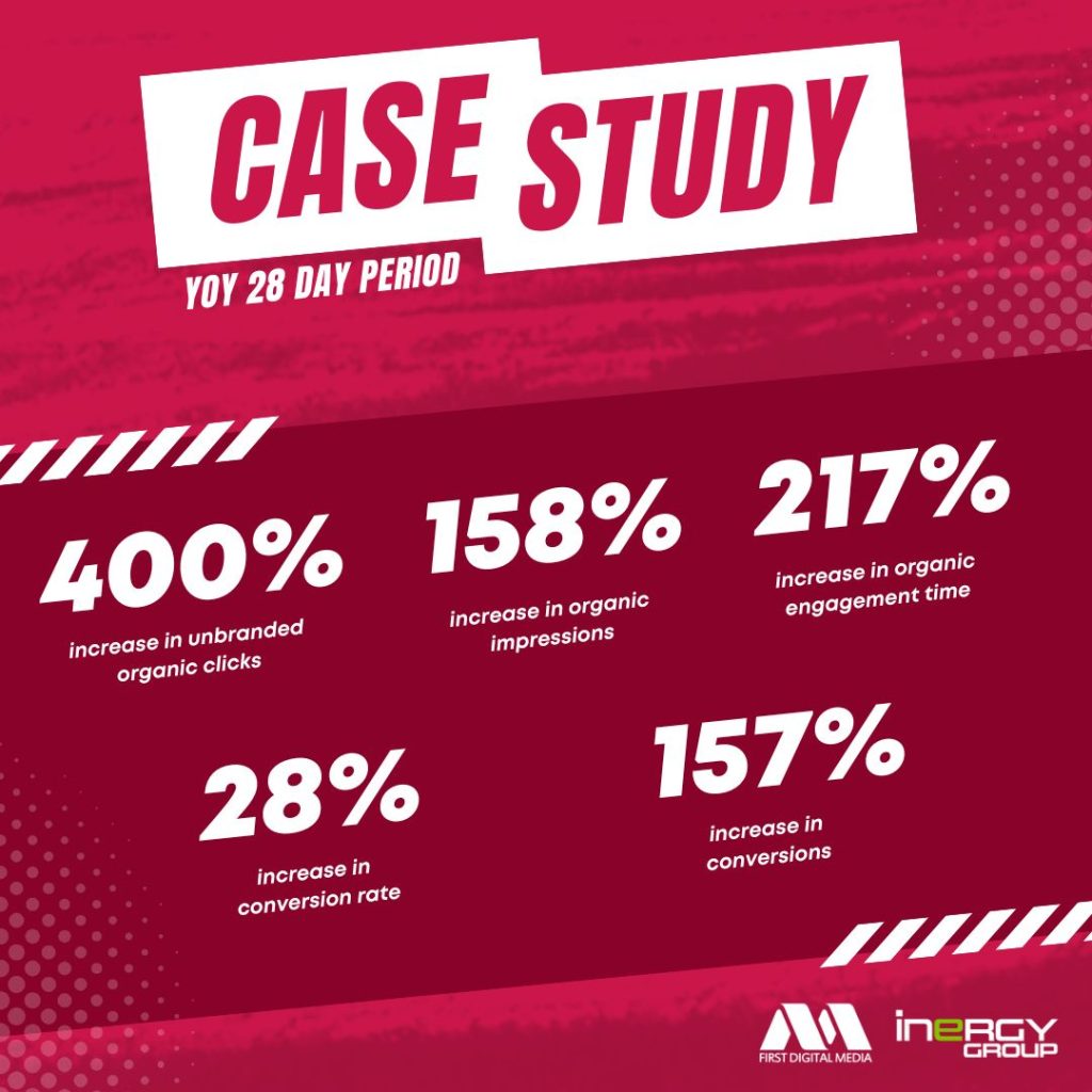
You may remember the trend for blogs which were just infographics that ran through many business blogs between around 2015-2017. Have you ever wondered why they suddenly caught on, or why they stopped?
Have you noticed how common they are on business-aligned social media platforms like LinkedIn?
Possibly not – on LinkedIn in particular, infographics aren’t so instantly recognisable, because they’ve been converted into carousels. So instead of seeing all that information laid out at once, you click through.
Why Use Infographics?
There are plenty of good reasons to use infographics as part of your marketing.
- They’re great for visual learners
- You can lay facts and figures out clearly
- They’re eyecatching
- They get shared
The first two are important in offering value to social followers and site users; you’re giving them information (hopefully information that’s useful for them to know) and making sure it’s easy to process and assess that information.

The second two are valuable for marketing. Scrolling through your social feed you might skip a text post with the same information but a brightly coloured image with good composition gets you to linger long enough to notice the content is relevant, and if you want to send that information to someone else, it’s visibly branded.
That ten-year-old trend in infographic blog posts was built on that fact. You couldn’t copy/paste the relevant section, you had to send the image, and that meant the branding came with the information. At a time when a common direction to content creators was “go viral”, infographics offered a powerful tool for doing just that.
Their focus on key information presented in a clear, friendly style is also a useful way of thinking in this new era of AI-powered search engines.
Why Shouldn’t You Use Infographics?
This is a tricky question because we’re obviously going to say you should be – but not for everything and not always. Why not?
- Not everyone is a visual learner
- Computer image recognition isn’t perfect, so the information may not be clear to search engines
- Some topics don’t simplify down well (like this one!)
- They present real accessibility challenges for some of your audience
Put another way, they should be part of your strategy, but not all of it – and for those of you who are concerned about accessibility, consider adding a transcript of the key facts from your infographic on the blog or social post.
This can also help any search engine which isn’t perfect at reading text from an image – which at the time of writing is all of them (although yes, they’re getting better).
Where Do Infographics Really Shine?
Any visual form of social media is a great place for infographics, as is any web page where some of the information needs to be condensed.
Social media algorithms monitor a lot of factors when deciding whether to feature your post to a wider audience. Two of the most powerful for infographics are dwell time and interaction rate.
Dwell time is simple – if you scroll past something, it has almost no dwell time. Stop for a while to study it carefully, and its dwell time increases.
Interaction rate is also simple – what proportion of the people who see your post interact with it? An interaction is anything – a Like, a comment, a share – but it’s also clicking the Read More link on any post where part of it is hidden, clicking to enlarge an image so you can see it more clearly, or clicking through the pages of a carousel or an image album.
As you can imagine, infographics are a great way to really boost both metrics, which in turn increases your account’s reach.
On a website, consider breaking your infographic into sections. Between those sections you might provide a transcript (so search engines can understand the value of the page) but a better way to do it is to provide any extra insights you might have on each section.
So if you’re talking about the things you’ve achieved for a client (for example) you can go into a little detail about how you did it and what that might look like for other clients.
As AI gets better at reading text on images, this may be less necessary, but for the meantime try to find ways to make the images and the text both work to their best advantage.
Cross-Platform Consistency
A final thought on how you can use infographics – they allow you to build real consistency across your various platforms, both visually (with brand colours, typefaces, and logos) and in what you discuss.
Once you’ve created a piece of content for one channel, ask yourself how you’d change it to make it more effective on your other channels.
This might be as simple as changing the dimensions of the image to suit a different social media platform or as intensive as presenting a different interpretation of the data. (For example, if you cater to residential and business customers, a change in legislation might mean you need to tell both customer bases the same facts, but your LinkedIn post would concentrate on how it affects business, while your Instagram post might be more about the residential impact.)
Strong social media performances aren’t separate from your SEO, Google Ads and Meta Ads strategies. Done right, they all come together in a rounded digital marketing strategy that’s more effective than the sum of its parts.
If you’d like to understand how to put that into practice for you, contact us and we’ll be happy to help.


